
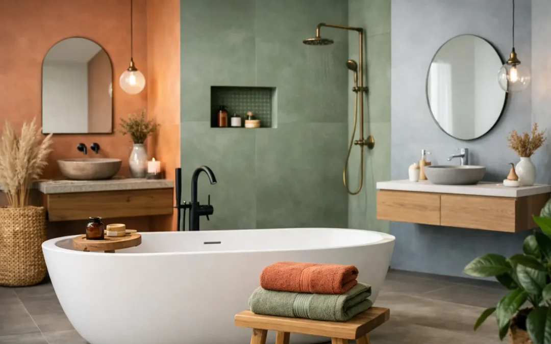
A bathroom can be perfectly planned, beautifully fitted and still feel slightly wrong if the colours do not suit the room, the light or the people using it. The bathroom colour trends 2026 are moving away from stark, one-note schemes and towards spaces with warmth, depth and a more personal feel. The most successful choices will not look fashionable for one season only. They will make a busy family bathroom easier to live with and turn an en-suite into a place to pause at the start or end of the day.
For homeowners planning a refurbishment in Maidstone and across Kent, the key is not to copy a showroom image exactly. It is to take the direction of current colour trends, then adapt it to your property, your practical requirements and the finish you will still enjoy in years to come.
Bathroom colour trends 2026: warmth over stark white
Cool grey and bright white bathrooms have had a long run. They can still look crisp in the right setting, particularly where a clean contemporary look is the aim, but 2026 is likely to favour softer, more grounded alternatives. Think chalk, warm ivory, oatmeal, putty, mushroom and pale stone rather than brilliant white or blue-based grey.
These shades work especially well in bathrooms because they respond kindly to the materials already found there: porcelain, natural stone, timber-effect finishes and brushed metalware. They also tend to make a room feel more comfortable under artificial light, which matters in bathrooms with small windows or no natural daylight.
Warm neutrals are not a shortcut to a bland room. Their strength is that they create a calm background for more distinctive choices, such as a veined tile, a painted vanity unit or an aged-brass tap. In a compact cloakroom, a full scheme in one warm neutral can feel considered rather than cramped when there is texture in the tile, plaster-effect wall finish or cabinetry.
Choose the undertone before the shade
A beige that looks welcoming in a south-facing showroom may appear grey, yellow or even pink in your own bathroom. Before settling on a paint, tile or furniture finish, consider the direction of the room, the size of the window and the type of lighting planned around the mirror and ceiling.
This is also where seeing finishes together is invaluable. A wall tile, floor tile, basin, worktop and brassware each have their own undertones. What looks like a simple off-white scheme can clash if one element is cream and another is a cooler grey white. A proper design consultation allows those decisions to be made as a whole rather than one sample at a time.
Earthy greens remain a confident choice
Green has become a reliable bathroom colour rather than a passing novelty, and its direction is becoming more natural. Olive, moss, sage, eucalyptus and softened forest green all have a place in 2026. These shades bring a sense of connection to nature without asking a bathroom to look like a themed space.
A muted green vanity unit is a particularly practical way to introduce colour. It gives the room a focal point, works with white sanitaryware and allows walls to remain lighter where daylight is limited. For a more immersive scheme, green wall tiles can be paired with a pale stone floor and warm metal finishes. This approach suits both period homes and newer properties, but the depth of green should reflect the room’s proportions.
Dark green can be elegant in a large en-suite or well-lit bathroom. In a smaller room, it is often best used below dado height, inside a shower niche, on one tiled wall or through furniture. The question is not whether dark colours make a room smaller. They can make a room feel enveloping and characterful. The real consideration is whether there is enough contrast, light and reflective surface to keep the room comfortable to use each morning.
Clay, terracotta and sun-baked tones add character
One of the more expressive bathroom colour trends for 2026 is the return of earthy clay shades. Soft terracotta, rust, muted coral, cinnamon and warm pink-beige can bring life to bathrooms that might otherwise feel clinical. Used with restraint, they offer a timeless, Mediterranean-influenced warmth rather than a statement that will quickly date.
These colours are most convincing when their finish feels natural. Matt tiles, mineral-effect surfaces, handmade-look ceramics and lightly textured paint are better partners than high-gloss materials. Pair them with creamy neutrals, pale oak tones and off-white sanitaryware for balance.
There is a trade-off. Stronger warm colours can dominate a small bathroom if used across every surface. A terracotta floor with an ivory wall tile, for example, may give more longevity than terracotta on walls, floor and cabinetry together. If you love a bolder hue but are unsure about committing, use it in a cloakroom, shower recess or vanity unit where it can make a clear impact without controlling the whole room.
Blue is becoming softer and deeper
Blue remains a natural choice for bathrooms, but the direction is shifting away from icy aqua and bright coastal shades. Dusty blue, mineral blue, denim, smoky teal and deep ink tones are more in keeping with 2026. They feel settled and sophisticated, particularly alongside limestone-look tiles, walnut-effect furniture or brushed nickel.
Pale blue can still work in a small bathroom, although it needs warmth around it. Combine it with a soft white rather than a brilliant one, and consider warm lighting to prevent the room from feeling cold. Darker blue is often excellent for furniture because it brings depth while leaving the walls and floor free to keep the space bright.
If your home has a traditional character, a muted heritage blue on cabinetry can sit comfortably with panelled details and classic fittings. For a more modern look, choose a flat-front unit in a dark mineral blue and keep the surrounding tile large format and simple. The colour may be similar, but the style of furniture and finish of the materials will determine the final result.
Rich accents are replacing all-grey metal schemes
Colour is not confined to walls and tiles. In 2026, warm metallic details continue to add refinement to bathroom schemes. Brushed brass, antique bronze and warmer nickel finishes work particularly well with the earthier palette now emerging. They bring contrast to green, clay, blue and neutral bathrooms without the hard edge of highly polished chrome.
Consistency matters more than matching every detail perfectly. Taps, shower fittings, handles, mirror frames and lighting should appear intentional together. Mixing metals can work, but it needs a clear hierarchy. For example, brushed brass taps may sit well with a darker bronze mirror frame if one finish is clearly dominant and both have a softened appearance.
This is not an instruction to remove chrome from every plan. Chrome remains practical, familiar and often better suited to a tighter budget. It can look excellent with cool stone, white tiles and a clean contemporary design. The point is to choose it because it fits the scheme, not because it is the default.
Use colour to support the way the bathroom works
A lasting bathroom scheme has to cope with daily life. In family bathrooms, very pale grout, matt black fittings and heavily textured surfaces may look striking, but they can demand more cleaning than many households expect. Dark paint close to a shower area can also be less forgiving if ventilation is poor. Good design should be honest about these considerations from the outset.
Mid-tone floor tiles are often the most sensible choice for busy rooms because they disguise the everyday marks that pale and very dark floors can emphasise. For the same reason, a coloured vanity unit can be more practical than a brilliant white one, particularly where children are using the bathroom. In an en-suite, you may be able to prioritise mood and luxury more strongly, but cleaning, storage and ventilation still deserve equal attention.
Lighting changes colour dramatically. A warm-white lighting plan generally flatters the natural, earthy colours of 2026, while good task lighting at the mirror makes the room more useful. Do not select your final palette under a single ceiling light. Review samples in daylight and with the proposed lighting wherever possible.
Build a scheme around one clear starting point
The easiest way to avoid a bathroom that feels busy is to begin with the element you genuinely love most. It may be a patterned floor tile, a richly coloured basin unit, a slab-effect wall tile or an unusual brassware finish. Let that feature lead, then choose quieter supporting colours and materials around it.
A well-planned bathroom rarely relies on every surface making a statement. Usually, one principal colour, one neutral and one accent are enough. Texture can provide the rest of the interest: fluted furniture, soft matt tiles, subtle stone veining or a tactile painted finish all add depth without adding more colours.
At MBK Design Studio, the aim is to help clients make those choices with confidence, from the first layout ideas through to a finished bathroom that suits their home and routine. Trends are useful when they reveal possibilities, but the best colour is the one that still feels right after the samples have gone away and everyday life has begun. Choose a scheme that gives you that feeling, then let quality planning and carefully selected finishes do the lasting work.