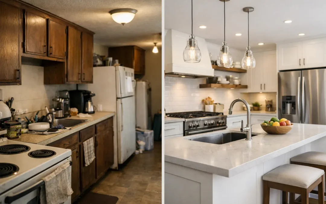
A kitchen transformation is rarely just about replacing dated doors. The most useful kitchen before after examples show a room becoming easier to cook in, calmer to live with and better suited to the people who use it every day. A striking photograph may capture the new worktops and cabinetry, but the real success is usually found in the details: a clear route through the room, a place for the food shop, and enough worktop space for a busy weekday evening.
For homeowners planning a renovation in Maidstone or the surrounding Kent area, before-and-after projects are valuable because they reveal what good design solves. They also help set realistic expectations. Not every kitchen needs an extension, a wall removed or a complete change of style. Sometimes the biggest improvement comes from planning the existing footprint properly.
Kitchen before after examples: what to look for
When comparing before and after photographs, look beyond the finish. Ask what has changed in the layout, where the storage has gone and how the room now supports everyday routines. A beautiful kitchen that leaves nowhere to prepare a meal, unload the dishwasher or put household paperwork will quickly lose its appeal.
The strongest transformations tend to address a specific frustration rather than follow a passing trend. Perhaps the old kitchen had a narrow galley layout that trapped two people at either end. Perhaps a family table blocked the only route to the garden. Or perhaps an open-plan room had plenty of floor area but no defined zones, so appliances, toys and clutter were always on display.
The following examples describe the kinds of changes that make a meaningful difference and the decisions behind them.
1. The cramped galley becomes a well-planned working kitchen
Before, a galley kitchen can feel restrictive: wall units looming overhead, shallow worktops interrupted by appliances and doors that collide whenever more than one person enters. It is tempting to remove every wall, but that is not always necessary or sensible. Structural work adds cost, disruption and timescales, and a compact room can be exceptionally efficient when it is planned around its proportions.
After, the improvement may come from using full-height cabinetry at one end, keeping the main run visually open and selecting integrated appliances to reduce visual interruptions. Deep pan drawers can replace awkward base cupboards, putting pans and dry goods within easy reach. A carefully positioned tall fridge and oven housing can also free a continuous preparation area.
Colour matters here, but not in a simplistic way. Pale finishes can make a smaller kitchen feel lighter, while a deeper timber or painted tone can give it character and depth. The better choice depends on natural light, the adjoining rooms and how much visual contrast the homeowner enjoys. Good lighting beneath wall units and within key storage areas often has more practical impact than choosing white cabinets alone.
2. The dated family kitchen gains storage without feeling clinical
Many older family kitchens suffer from a familiar problem: too many small cupboards and nowhere for the things modern households actually own. Air fryers, coffee machines, lunch boxes, recycling, pet food and charging cables gradually claim the worktops. The room looks untidy not because the family is disorganised, but because the kitchen was not designed for their routine.
A successful after design gives everyday items a deliberate home. Wide drawers make crockery and cookware easier to access than deep cupboards. A larder cabinet can hold groceries in one visible place. A dedicated utility zone for cleaning products, bins and recycling reduces pressure on the main cooking area. This is not about hiding every sign of life. It is about making the room easier to reset at the end of the day.
The visual finish should still feel like part of the home. A painted shaker kitchen may suit a period property, particularly when paired with warm timber, a ceramic sink or a traditional-style handle. In a newer home, a handleless or slim-frame design can create a more architectural look. Neither approach is automatically more luxurious. Quality lies in proportion, materials, function and careful detailing.
3. The underused dining room becomes part of the kitchen story
Before, separate kitchens and dining rooms can leave both spaces feeling compromised. The kitchen is too small for more than one cook, while the dining room is saved for occasional use. Opening the rooms together can create a generous social space, but it must be planned with care. A larger room can be harder to furnish and may become noisy or cold if every surface is hard and reflective.
After, the best open-plan kitchens give each activity its own place. The cooking zone needs sufficient worktop space and safe clearances around hot appliances. The dining area should feel connected without sitting directly in a busy circulation route. A seating area may work well near garden views, but it should not prevent access to cabinetry or doors.
An island often features in these kitchen before after examples, yet it is not a requirement. Islands need enough surrounding space to be genuinely useful. In some rooms, a peninsula offers the same sociable perch, extra storage and a visual divide without making the layout feel crowded. This is where measured planning matters more than a wish-list image.
4. The awkward corner becomes useful storage
Corners are frequently wasted in older kitchens. A door may open into a blind space, or a low cupboard may be difficult to reach, so items disappear at the back and are forgotten. The after solution is not always an expensive mechanism. Sometimes a different cabinet arrangement, a pull-out solution or relocating a tall unit makes far better use of the available space.
This example highlights a useful principle: every cabinet should earn its place. A tall cupboard may look impressive, but it can overwhelm a room if it blocks light or leaves too little worktop. Equally, adding more units is not always the answer if they create a cluttered, top-heavy effect. The right balance depends on what needs storing and which activities take priority.
At the design stage, it helps to consider storage by category rather than cabinet type. Think about food, pans, tableware, cleaning supplies, small appliances and the less obvious items such as trays, bottles and pet supplies. This produces a kitchen that works naturally from day one, rather than one that needs constant rearranging.
5. The dark kitchen becomes brighter without losing warmth
A dark room is not necessarily a bad room. Deep cabinetry can be elegant, especially in a larger space with good daylight. The issue arises when poor lighting, heavy finishes and limited reflective surfaces make cooking and cleaning difficult.
After, a brighter kitchen may use a combination of task, ambient and feature lighting. Task lighting illuminates worktops where it is needed. Ambient lighting makes the room comfortable in the evening. Feature lighting can draw attention to a dining table, shelves or an island. Relying on one central ceiling fitting rarely gives a kitchen the flexibility it needs.
Reflective worktops, glazed cabinetry or a lighter splashback can help bounce daylight around, but they should complement the wider scheme rather than be added as a quick fix. A warm neutral palette, natural wood texture and layered lighting can feel brighter while retaining the welcoming character many homeowners want from the centre of the home.
What photographs cannot tell you
Before-and-after imagery is inspiring, but it does not show every decision that affects the finished result. It cannot tell you whether electrical positions were improved, whether awkward floor levels had to be addressed or whether the cabinetry was designed around an existing window, boiler or doorway. These factors influence both the design possibilities and the budget.
It also cannot show how much planning happened before work began. A well-managed kitchen project considers product lead times, the order of trades, measurements and the practical question of how a household will cope while the room is out of use. Honest advice at this point is more helpful than a promise that every project will be quick or straightforward.
At MBK Design Studio, the starting point is not a standard layout or a favourite door style. It is a conversation about how you live, what does not work now and what you want the finished room to achieve. With more than three decades of experience, the team can help turn visual inspiration into choices that make sense for your property, priorities and budget.
Build your own before-and-after brief
Before visiting a showroom, take photographs of the current room from every angle and note the moments that frustrate you. Is it the lack of preparation space? The queue around the fridge? The pile-up of recycling? The fact that the kitchen looks good in daylight but gloomy at night? Those observations are more useful than a long list of features with no purpose.
Bring inspiration too, but use it as a starting point. A kitchen you admire online may have twice the floor area, different ceiling heights or far more natural light than your own. The goal is not to copy it exactly. It is to understand why you like it, then create a version that belongs in your home.
The most rewarding after photograph is the one you do not need to stage: a kitchen with room for breakfast, homework, dinner preparation and the ordinary mess of family life, all without feeling like hard work.